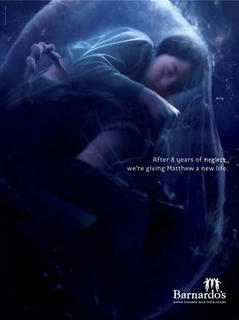
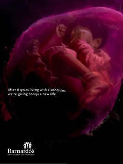
 Whilst stuck in traffic recently I found myself next to a billboard displaying one of the posters from the new Banardo's campaign.
The posters make up a series of four photograph-like images depicting grown children each in an amniotic sac with a with a thick rope-like umbilical cord visible.
 Two of the posters are soft pinks and the other two are pale blues, perhaps alluding to traditional colours for baby boys and girls.
The children are clothed and encased in a large bubble-like amniotic sac, they themselves being curled in foetal positions.
 One of the images (top left in this article) has a light source, rather like an underwater shot.
Interestingly, there is one girl and one boy to each 'blue' shot, and one girl and one boy to each 'pink' shot. There is also no placenta or any other pregnancy-related detail visible. This may be appealing to the lay perception of pregnancy, and therefore extra detail is unnecessary.

The text on the posters is relatively small, the mystique lending power to the obscure murky image. The posters are effective, not due to impact, but by appealing to the 'second glance', something that turns your head.
I'd like to hear any thoughts on the posters - I think they are clever but suspect not everybody may enjoy the gravity of the issue.
1 comment:
Hi aj
I found these interesting but also unsettling. Organisations like Barnardo's now tend to work with troubled families rather than taking children out of their home environments, yet the ads imply the children have to be 'reborn' (with the help of charity) in order to effect a change in their circumstances. It's a disempowering discourse for those affected, and it draws on a visual tradition of fetal imagery in which the mother is rendered invisible.
Post a Comment